Introduction

This is a React Component that serves as a fully fledged visual programming interface, ideal for simulation.
It can additionally be customized to a certain degree with user-defined functions on top of the host of base components provided for general use cases.
Have a look at the tool in the playground :)
Table of Contents
- Installation and Setup
- Definitions
- General Usage
- The Main Inputs
- Shallow Components
- Deep Components
- Creating Custom Components
Installation and Setup
For users with an existing React-based project
- Use
npmto install the package to the project
npm install --save vizpro
- Import
Canvasinto the relevant file
import Canvas from 'vizpro';
For users with no existing project
-
The simplest and fastest way to get started is to use
create-react-appwith which you can set up a boilerplate React application. -
You’ll need to have Node >= 10.16 and npm >= 5.6 on your machine. To create a project, run the following commands via terminal in a directory where you want the project to be :
npx create-react-app my-app
cd my-app
npm start
-
In case you run into issues at this stage, you can read more about Create React App and React in depth here.
-
Use
npmto install the package to the project. Run the following command within themy-appfolder :
npm install --save vizpro
- Render the Canvas in
my-app/src/App.jsas shown
import React from 'react';

import { Canvas } from 'vizpro';

function App() {
    return <Canvas />;
}

export default App;
- The localhost will automatically render the component on saving.
Definitions
A definition refers to the current project workspace you have created on the canvas. It includes the state of the canvas (inputs, components, connections).
Creating a new definition
- Simply rendering the component gives you the ability to work on the canvas as you require. Jump to General Usage to learn how to use this tool.
Saving a definition
- Using the
Savebutton in the Top Bar, you can save your current definition in your browser’s local storage. This saved definition will be accessible on refresh and even on emptied cache and hard reload.
Clearing a definition
- Using the
Clearbutton in the Top Bar, any saved definition in local storage will be permanently removed.
Downloading a definition
- Using the
Downloadbutton in the Top Bar, the current definition can downloaded to your local computer as ajsonfile.
Opening a downloaded definition
- Using the
Uploadbutton in the Top Bar, the definition can re-instated. The uploaded file must be ajsonfile. - When a valid
jsonfile is uploaded, all the previous components and edges will be deleted.
General Usage
The tool consists of 4 major sections:
- The
Top Bargives you control over your definitions such as saving and clearing. TheTop Barcan be hidden by clicking the button on the top right corner. - The
Components Tabon the left holds all the in-house components as well as user-defined ones. Components are categorized, and the current category can be toggled through the column at the right edge of this tab. - The
Properties Taballows you to modify certain properties of select components, which can opened on double click of the specific component. - The
Canvasis where your components will be added and input/output modified as required. TheCanvassupports zoom while components support drag on the Canvas.
A look at the rendered tool
Creating a new component
A new component can be added onto the canvas by simply clicking on the relevant icon in the Components Tab.
- Hovering above component icons will identify each component with its name.
- Double clicking selected components will open the
Properties Tab.
Note: OnlySlider,Panel,Option ListandDeephave theProperties Tab.
Canvas state after adding a Panel and double clicking it
Setting inputs and outputs
- Flow of data from component to component can be set by connecting them with edges.
- Half circles on the left of a component represent the input and on the right represent the output.
- An edge can be created by connecting these half circles.
- Edges can be deleted by clicking the red circle at the middle of a drawn edge.

Slider output connected to a panel as input
The Main Inputs
These are integral components that help with the input, selection and flow of data. They don’t process input data according to a preset function like Shallow or Deep components.
Slider

Slider Component and its Properties Tab
- The
sliderallows a sliding numerical input useful for simulation purposes. - The
min,max,stepandcurrent valuecan be set through the Properties Tab. - The
current valueof the slider can also be changed by dragging the anchor of the slider.
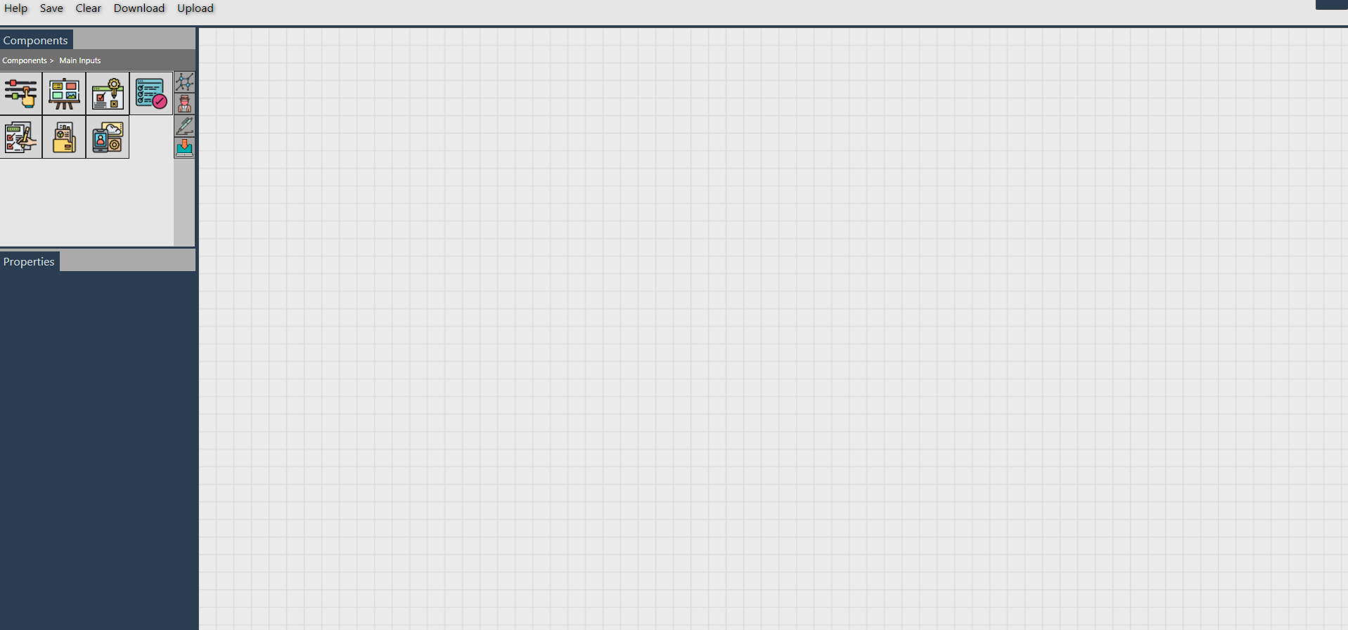
Panel

Panel Component and its Properties Tab
-
The
panelcan be used to input a variety of types :text- Accepts free user input as stringhtml- Renders the given html provided it is validjson- Renders a visual tree view provided a valid objectlist- Accepts a list of valuesplot- Renders a plot of the given input.
The input follows this format:
{"type": type, "data": [details]}where
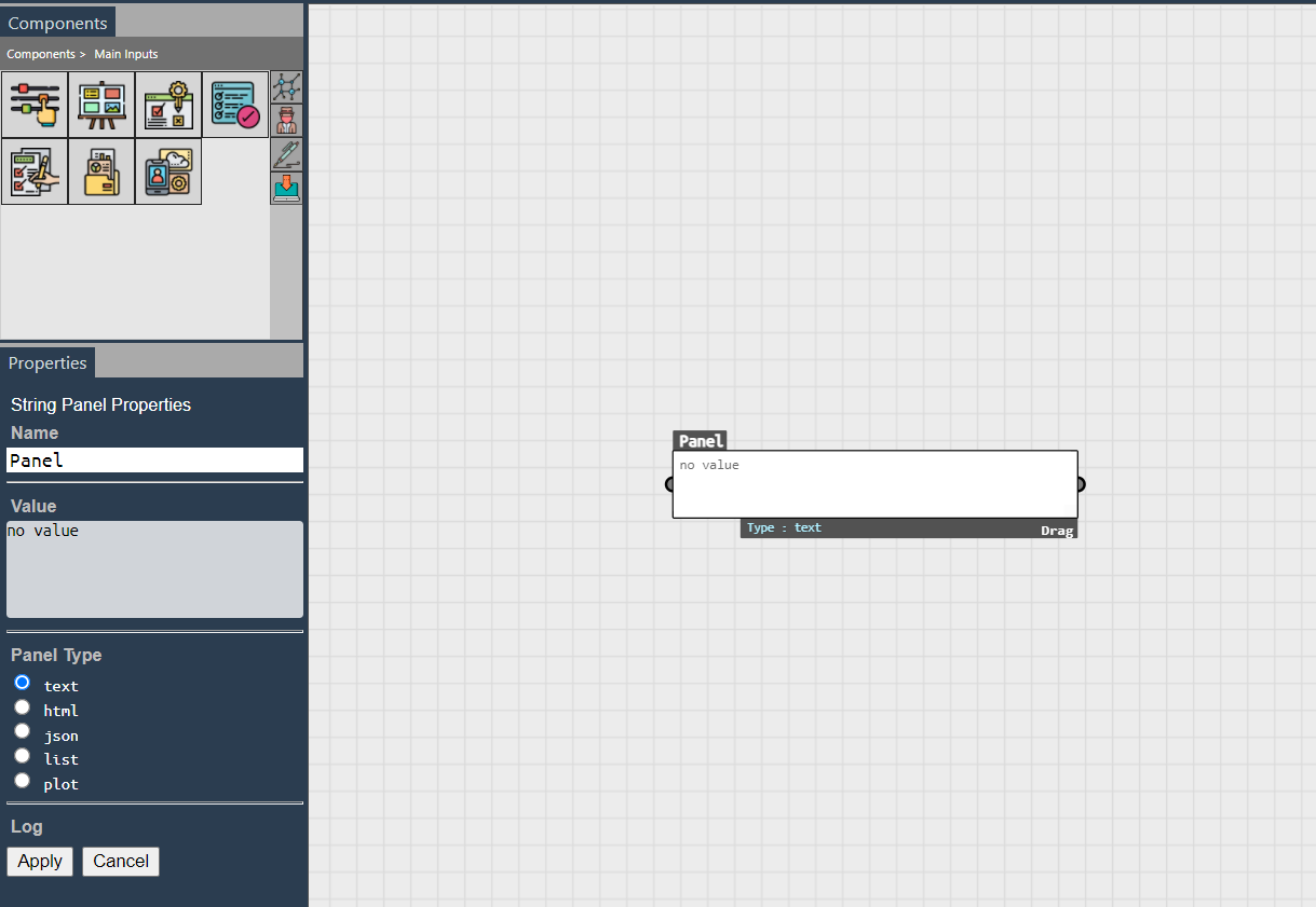
typerefer to the type of the plot (bar, pie, scatter, etc) anddetailsrefers to the actual details of the panel.Refer the Plotly site for formatting thedetailsvalue.-
Example 1:
- Input:
{"type": "scatter", "data": [{"x": [1, 2, 3, 4], "y": [10, 15, 16, 17], "mode":"markers", "name":"Temperature"}, {"x": [2, 3, 5, 9], "y": [15, 12, 18, 5], "mode":"markers", "name":"humidity"}]}- Output:
-
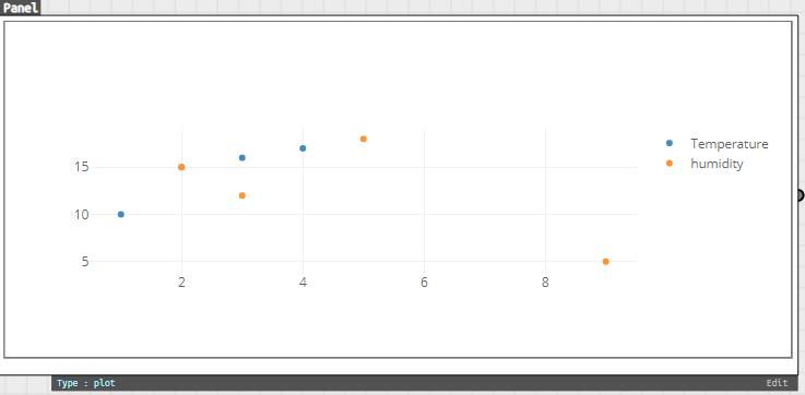
Example 2:
- Input:
{"type":"pie","data":[{"values": [19,26,55], "labels": ["Residential","Non-Residential","Utility"], "type":"pie"}]}- Output:
-
The
panelcan be resized to provide better visibility of the content of the panel to users.
Toggle
- The
toggleprovides a basic true/false input when connected. - The boolean value toggles on double clicking.

Toggle Component
Option List

The Option List Component and its Properties Tab
- The
option listprovides a dropdown of options of which one can be selected. - The dropdown can be specified as a list in a
paneland connected to theoption listinput.
List View

The List View Component
- The
list viewfunctions similar to theoption listbut it allows multiple option selection and is rendered as a json tree view by default.
File Upload

The File Upload Component
- The
file uploadcomponent allows local files to be uploaded. - Uploaded files will saved in local storage until the project definition is cleared.
Deep

The Deep Component and its Properties Tab
- The
deepcomponent is used when the function that is to be to run is either in the cloud or located as a local file accessible via the project backend.input list- Takes in the name of each input separated by a newlineurl- The url to which the GET request is routed to
- More about setting up and usage at Deep Components.
Shallow Components
Shallow components refer to functions that will be run in real-time when inputs are provided.

The Average Component in use
| Provided component | Usage |
|---|---|
| Average | Calculate the average of an input list of numbers |
| Add | Calculate the sum of an input list of numbers |
| Min | Calculate the minimum of an input list of numbers |
| Max | Calculate the maximum of an input list of numbers |
| Difference 2 | Calculate the difference between 2 numbers |
| JSON Navigator | Traverse a JSON according to a given path |
| 3D Visualizer | Visualize a relevant 3D object in iframe given a valid url |
| Image Display | Visualize an image given a valid link |
| YouTube Display | Watch an embedded YouTube video given a valid link |
| Plot Panel | Plot the provided data given valid formatting |
| String to List | Converts a string-like list to a list |
| Replace | Replaces all occurences of a string in a text with a new one |
Deep Components
Deep Components run functions by sending GET requests to the provided url, which in turn would process the given input parameters and return the result.
After connecting all the inputs and outputs to a deep component, users need to click the Play button to start the asynchronous request and set the value to the output components.
Setting up a deep component
- Add the
Deepcomponent from theMain Inputs, and open itsProperties Tab. - Set the name of each input parameter separated by a newline, and the url.
- The component will render the input/output circles at this point, along with a run button.
- Run the function after connecting inputs/outputs.
- The asynchronous request will be processed and the result/error set to the output.

The Deep Component after setting inputs and url
Connecting to the cloud
- A cloud function can be defined on any available platform such as Google Cloud Platform.
- Ensure your function is public.
- Handle preflight requests as shown below and detailed here.
- The GET request sends the parameters as
p1,p2…pn. Therefore, request querying should be handled as such.

A Google Cloud Function using node.js runtime
Connecting to local files
- This is useful when there are scripts in your local machine written in other languages like
python. - A server is required to achieve this, so projects which already have a server/backend can use that, while other projects will need to incorporate one.
expressis relatively easy to set up for a server and we will use thechild_processnode module to spawn new processes to run the external scripts.
npm install --save express
npm install --save child_process
- Add a defined proxy for requests to get routed to, inside
package.json.
"proxy": "http://localhost:8080",
- Create a new
server.jsfile rooted atmy-app. A template that can be followed is provided at server.js.- To prevent CORS issues, ensure it is configured as shown in
server.js. - The template has set up a
/pythonroute that will run a python file given a valid filepath and any arguments necessary. Anything printed to stdout will be displayed. - The provided
/batand/rroutes allows such files to be executed. - The GET request sends the parameters as
p1,p2…pn. Therefore, request querying should be handled as such. - Additional routes can be added as necessary to run other files/functions as required.
- To prevent CORS issues, ensure it is configured as shown in
- Run the server simultaneously with
npm startin a separate terminal.
node server.js
- Use
http://localhost:8080/{route}as the url for theDeepcompoonent.
Creating Custom Components
Besides using pre-defined components, you can add new components to the tool by passing the required information of all the components you want to include as an array of JSON objects as props of the Canvas.
The Component JSON
Required Parameters
name: Name of the new componenttype: Allowed type values -> [component,optionList,string,deep]dftype: Allowed dataflow values -> [shlow,dp]inputList: A list of dictionary for each input, each with attributesname,shortName,desc,default_valueoutputList: A list of dictionary for each output, each with attributesname,shortName,desc,default_value-
name: Attribute required for each entry ininputList,outputList -
Shallow functions (type !=
deep, dftype =shlow)func: The function that is executed when the component is connected to an input.- The return should be a
jsonof 2 lists,typeandvalue. - The length of both lists should tally with the number of outputs in
outputList. - The
typelist gives the type of the corresponding entry in thevaluelist, and allowed type values are
[text,html,json,list,plot]
{
  type:  [],
  value: []
}
Format of function return value
-
Deep functions (type =
deep, dftype =dp)url: URL of the deep function
Optional Parameters
shname: Short namedesc: Descriptioncolor: Color (in hex)backgroundImage: URL to the image
To use these new components, pass it as the udo property to the Canvas component as follows, where newComps is the array of JSON objects.
<Canvas udo={newComps} />
-
Refer App.js to see how two components called
ExponentialandCloud - Absoluteare added to the tool. -
Refer stockComponents for details of additional, more specific, components.
-
The new components will be found in the
User Definitionstab of theLeft Container.
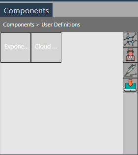
New user-defined components